The Pear Shaped Website - Skinny on Top with a Fat Bottom
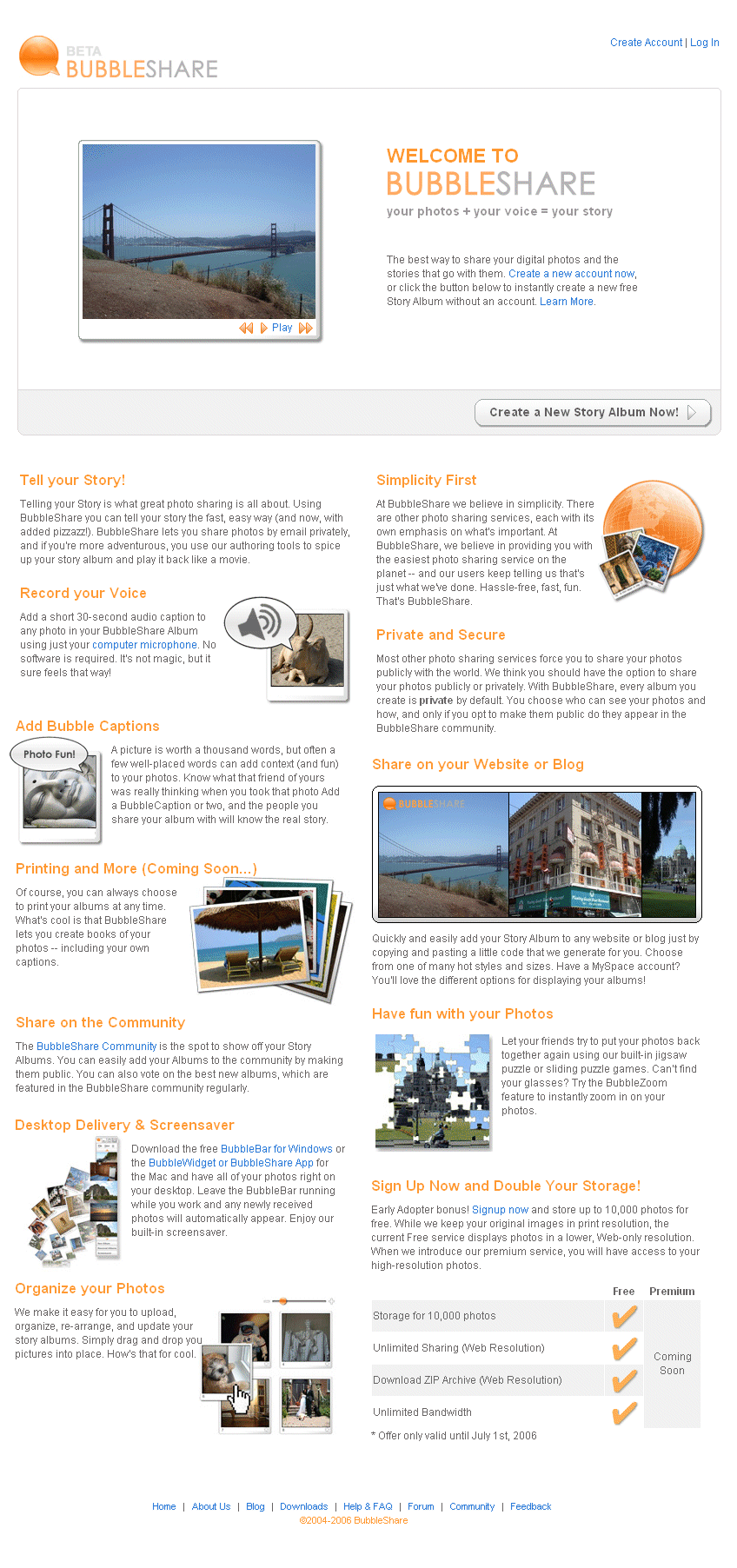
Lately I've been giving a great deal of thought on how to design the front page of a Website to maximize simplicity while also providing the maximum amount of marketing information. Our BubbleShare website is a perfect example. Our service is known for its simplicity, therefore I am leery about messing up the Google-like homepage with a pile of marketing.
Nevertheless, communicating to potential users about what is available 'under the hood' is critical. We have so many features that most users probably wouldn't even find. So I've come up with a concept called 'The Pear Shaped Website'. Ok cheesy name I admit....and I'm not the first to come up with it, but working in my little bubble I thought it make sense.
Basically the idea is to have the top of the website extremely clean with perhaps 1 or 2 action items at most. The height of the top section should roughly be 500 pixels so that on your average browser most people only catch a glimpse of the bottom marketing text.
The bottom line: Upon loading the website, users only see the very skinny 'simple' part of the website and can choose to engage one of the few calls to action. OR, with a simple scroll down, the user is exposed to all the fat marketing text.
Kudo's to Stephen Gay for making this design come to life!
posted by Chris Sukornyk @ 12:51 PM
1 comments
![]()
